Challenge
A case study of the Google Merchandise Store using qualitative and quantitative research to improve the e-Commerce website. The timeframe of this project was 2 weeks.
Software used
- Google Analytics
- Illustrator
- InDesign
- QuickTime Player (to record usability tests)
Findings
After distilling data from Google Analytics and creating usability tests to confirm these observations, I discovered that the Google Merchandise Store has a lot of room for improvement. The focus of this case study is on the user flow of finding products and the check-out process, other areas of the site require attention but are outside the scope of this project.
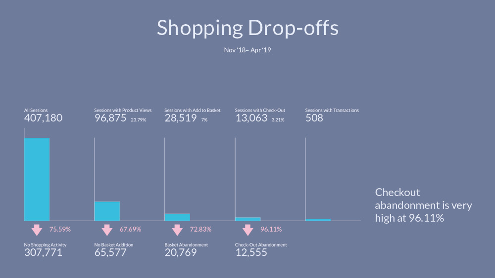
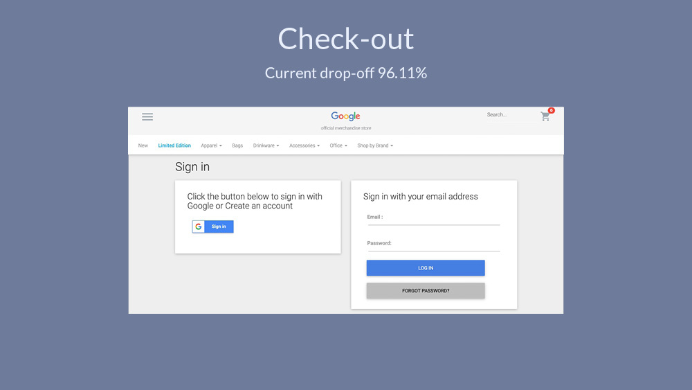
Recommended changes and Cart UI improvements to tackle checkout-out abandonment rate of 96.11% [Fig. 1] were realised from usability test insights.
Who are our users and how do they shop?
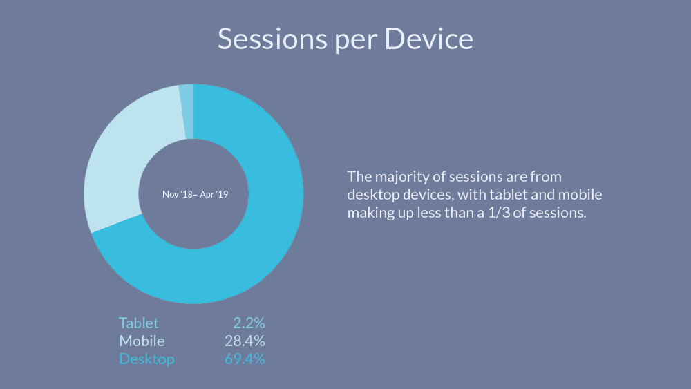
Before creating the usability tests, I wanted to gather data to see who our users are and how do they interact with the site. Over a third of sessions are from desktop devices [Fig. 2].
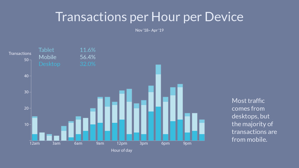
Considering the ratio of desktop sessions to mobile it was a little surprising to find that the majority of transactions actually come from mobile devices [Fig. 3].
I delved into this phenomenon a little further, so I looked at the sessions at each time of day and overlaid it on to the transactions [Fig. 4].
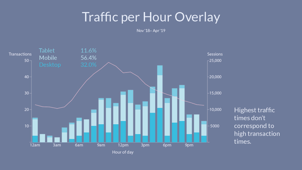
Google gives everyone access to their merchandise store's analytics, but this access isn't at admin level so not all info is available. I couldn't track people across devices, so my inference is an assumption that people search on their desktops – at work – and then in their lunch break or commute they are making the purchases on their phones.
Another interesting finding was how virtually no-one uses the site search bar [Fig. 5]. This could be influenced by an unnecessary animation that hides the search bar on scroll. To see the search bar, one has to be at the very top of the page (window.pageYOffset = 0).
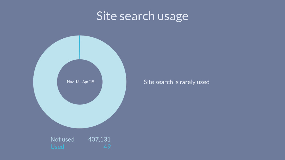
Although an interesting insight, in the usability tests, even once the users found the search bar (taking up to 10 minutes in one case) they didn't feel compelled to use it. They wanted to see a more general view of the products when shopping, shopping by category and seeing the different styles and colours was preferred. One user stated, "To be honest with you I didn’t even notice the search box, I wouldn’t have used it for the Onesie. Maybe for the pen I would have used the search. I tend to search by category anyway."
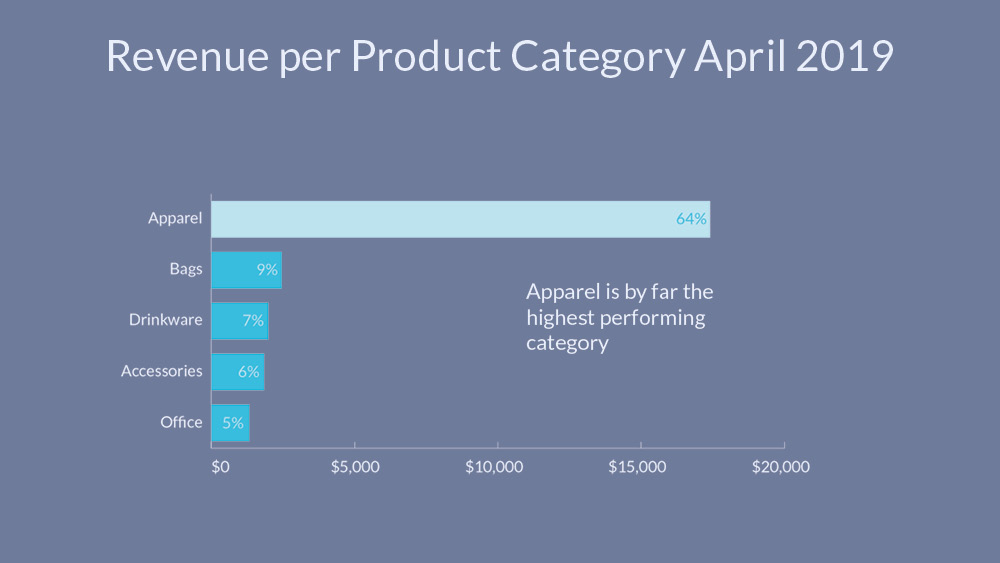
The strongest performing category on the eCommerce store is Apparel [Fig. 6].
An alarming statistic is the check-out abandonment rate of 96.11% [Fig. 7], I offer UI solutions to this further on after insights from the usability tests.
Usability testing
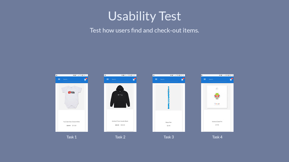
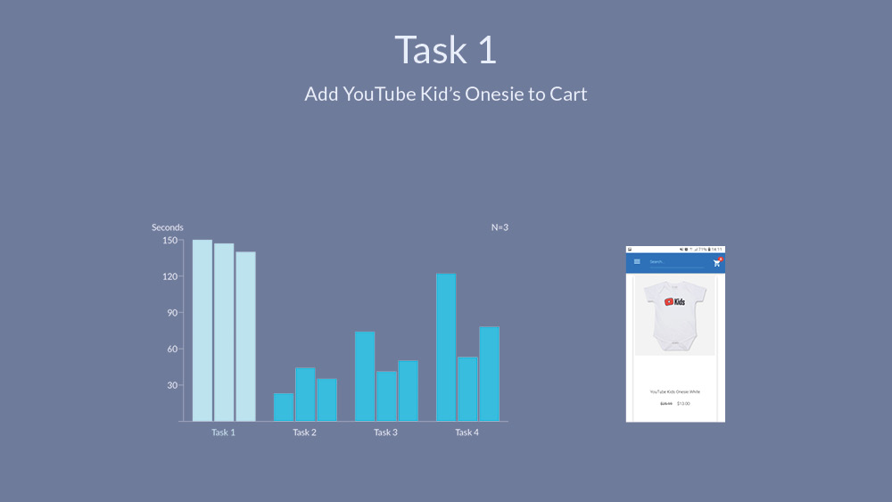
I conducted 3 usability tests and showed each person an image of a product to be added to the shopping cart, one at a time [Fig. 8]. After the 4 items were added to the cart, the users checked-out until the payment screen. The 4 tasks, adding an item to the cart, were timed.
Task 1, find the 'YouTube Kid's Onesie White', proved to be difficult for all 3 testers... But why? [Fig. 9]
Making the user think
The biggest confusion the site caused the users were the broken links at the bottom of the Home page [Fig. 10]. Upon seeing an image of a similar item to what they were looking for and it being titled 'View all kids Apparel', each user clicked on this. Instead of being directed to the Kids Apparel category, as expected, they were directed to the specific item pictured, 'Google Protector Onesie Navy'.
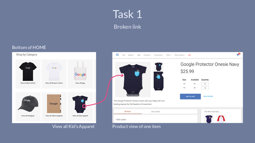
This was true for each of the 'Shop by Category' links, causing a lot of confusion. A user said, "Ah huh, somehow I found another section, I don’t know how that worked out"
N.B. I checked back a few weeks later and the broken links were fixed, good work Google!
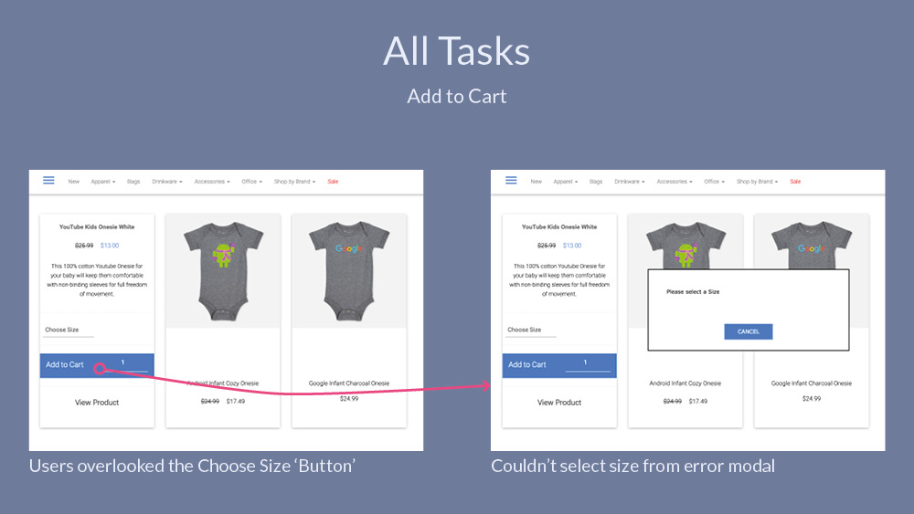
Unfortunately the confusion wasn't limited to the broken links. All users encountered a problem when adding apparel to the cart [Fig. 11]. Each time the user clicked 'Add to Cart', the choose size input was overlooked and the error modal didn't allow for size selection. The user had to close the modal and then choose the size.
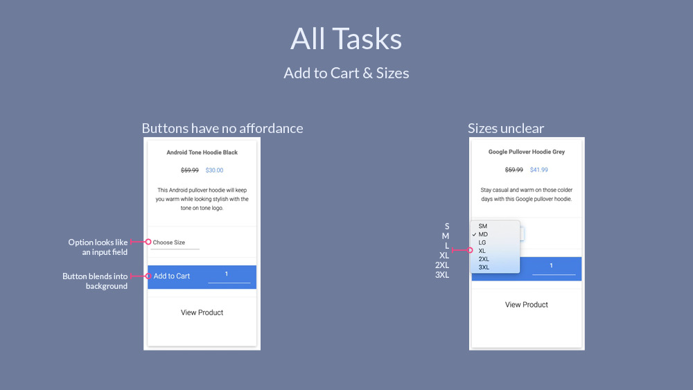
Why did the user miss the 'Choose Size' selection? The select option isn't styled like a drop-down and the button 'Add to Cart' isn't styled like a button [Fig. 12]. Both these interactive elements don't have the proper affordance and increase the cognitive load on the user. Furthermore, once the user clicks on the 'Choose Size' drop-down, they are met with bizarre abbreviations for apparel sizes; SM, MD and LG. One user commented, "SM, I don’t know what that is… Small medium?".
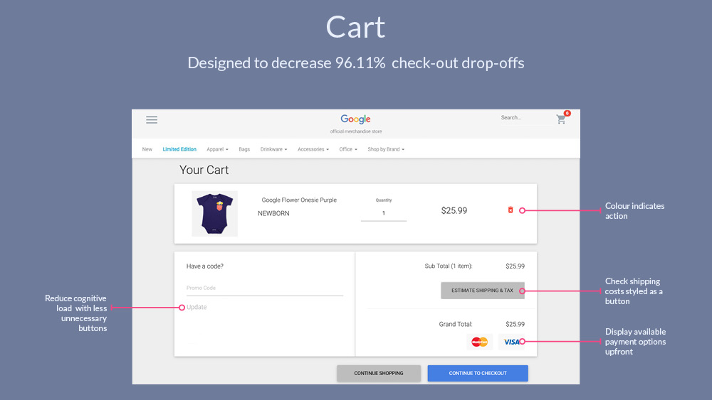
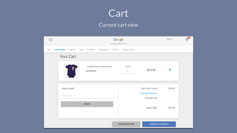
Improving the cart & check-out
The current Cart [Fig.13] can be improved to reduce drop-offs further down the funnel.
Even these simple changes [Fig. 14] could have a big impact on reducing abandonment and helping the user through the check-out process. None of the users that I tested noticed the 'Estimate Shipping', making the 'Estimate Shipping' look like a button (once again improper affordance) could improve check-out abandonment because users will realise they don't have to go further into the funnel to get shipping and tax pricing. This same rational can also be attributed to displaying the payment options on the cart, rather than waiting until the Payment page.
Currently one must sign-in to check-out [Fig. 15].
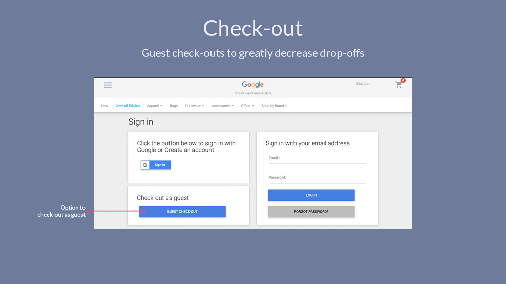
Guest check-outs greatly reduce check-out abandonment [Fig. 16].
Summary
With these changes I'd expect a drop in check-out drop-offs and greater user satisfaction with the check-out process. These changes should be tracked further with Analytics concentrating on abandonment rates.
It was good to see that the broken category links were fixed weeks later, because this caused a lot of confusion for the user. The affordance on the 'Choose size' option and also the 'Add to cart' button really needs to be changed to reduce 'user error' (it isn't actually a user error, this is a design error). Also a content review is necessary, focusing first on the abbreviations of sizes.