Challenge
To create an app to help combat Fear of Missing Out (FoMO), using insights from interviews with people who present FoMO and also research from behavioural scientists. The timeline for the project was approximately a month.
Deliverables:
- Storyboard
- Persona
- Mood board
- Logo & branding system
- Wireframes
- InVision Studio clickable prototype
Solution
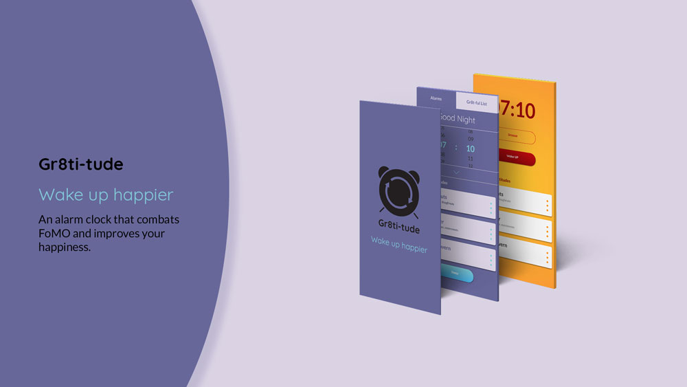
Gr8ti-tude is a self-help alarm clock to help combat FoMO in an ever increasingly connected world. Importantly the solution isn't another app/service to get addicted to or even deleting your social media accounts.

Using the alarm clock (setting and waking up to) as an external trigger, Gr8ti-tude offers the user a chance to create a positive tiny new behaviour to receive health benefits and improve general happiness. Gr8ti-tude is based on proven psychological principles of practicing gratitude.
Software used
- Sketch
- Indesign
- Photoshop
- Illustrator
- InVision Studio
Research
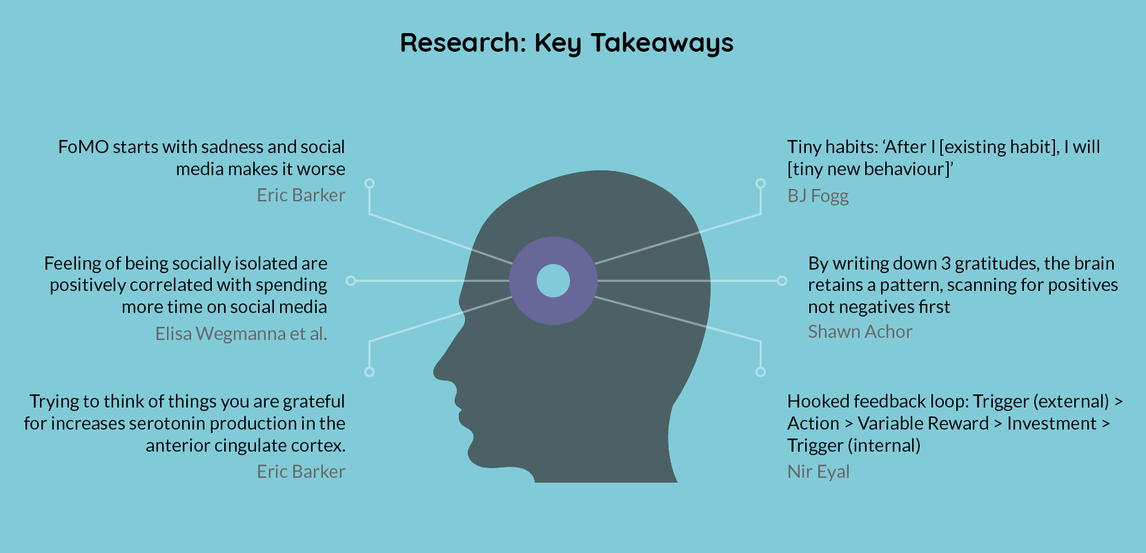
I wanted to combat FoMO by looking at the problem through the eyes of behavioural scientists. For definitions and health dangers of FoMO I researched Przybyzlski et al. and Elisa Wegmanna et al. Which led me to focus on the subject of habits and controlling habits exemplified by Eric Barker, Shawn Achor, BJ Fogg and Nir Eyal. You can see my research notes here.
Key takeaways
- FoMO starts with sadness and social media makes it worse
- The more a person is inclined to gratitude, the less likely he or she is to be depressed, anxious, lonely, envious, or neurotic
- Gratitude can boost serotonin, you don’t even have to find anything, it’s the searching that counts
- By writing down 3 new things you are grateful for, the brain retains a pattern, scanning for positives not negatives first
- Forming tiny new behaviours: ‘After I [existing habit], I will [tiny new behaviour]'
- Hooked feedback loop: Trigger (external) > Action > Variable Reward > Investment > Trigger (internal)
Interviews
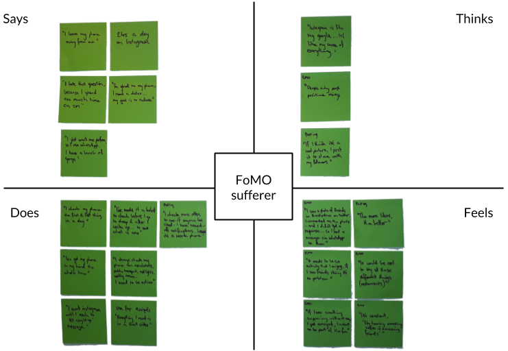
I interviewed 3 people to find out about their smartphone habits and asked them about suffering from FoMO in general. At the end of the interview I gave the participants a survey which was based upon the work of Przybyzlski and colleagues (2013). This was to ascertain how the people fit onto the FoMO Scale, created by said researchers. Each interviewee fit into the category of suffering from a medium level of FoMO. My research plan is available to view.
Key takeaways from the interviews
- People feel they use their phones/social media too much
- Want to reduce but don’t seem to actually do it (I always have my phone at hand/I try to keep my phone away from me)
- Check their phone first thing in the morning and last thing at night
- Experience FoMO
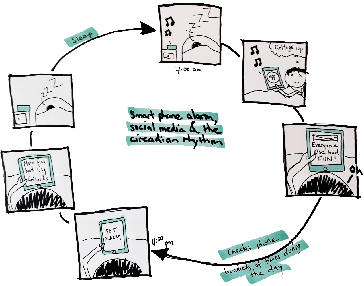
Why do the interviewees check their phones when they wake-up and just before sleeping? The alarm clock on their smartphones. It is an external trigger, forcing one to reach for ones phone when they wake-up and just before they sleep.
Persona
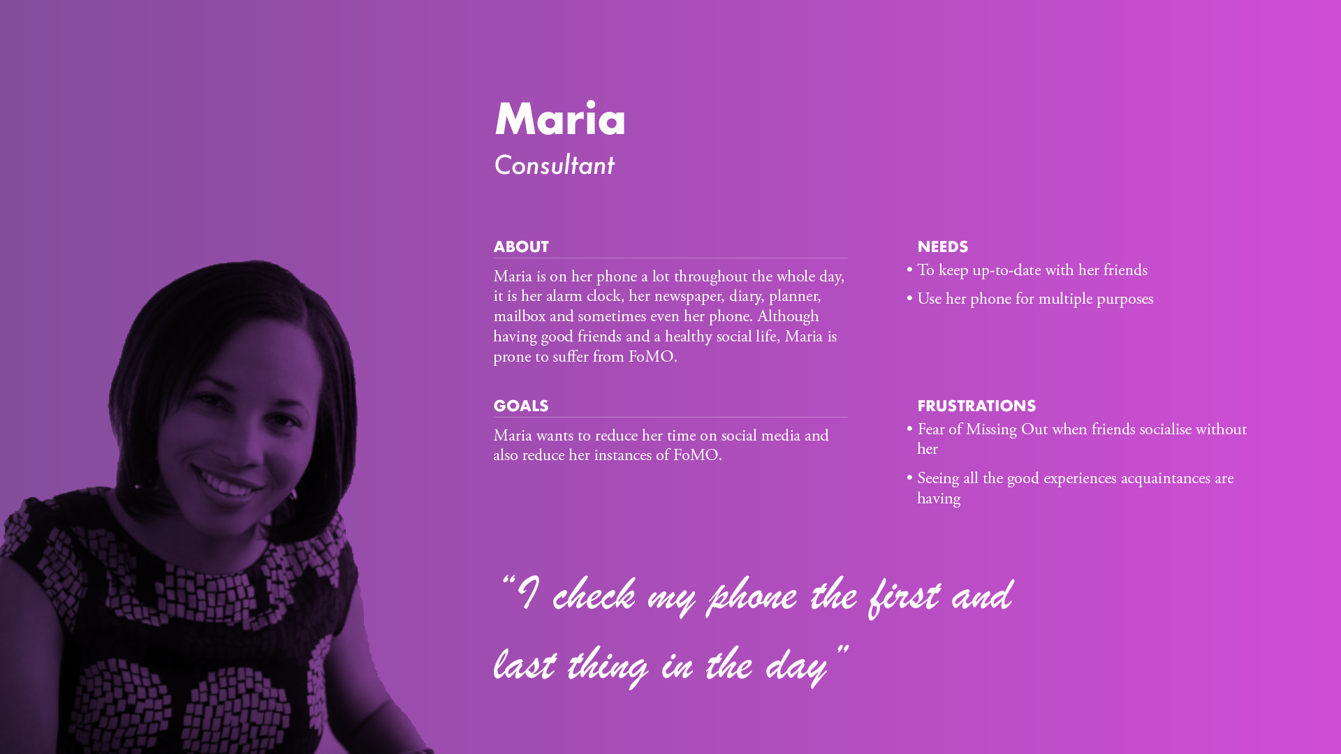
Maria is on her phone a lot throughout the whole day, it is her alarm clock, her newspaper, diary, planner, mailbox and sometimes even her phone. Although having good friends and a healthy social life, Maria is prone to suffer from FoMO.
Problem statement
Using the interviews and the research into FoMO and habits, I wanted to try to create an app that makes people more resistant to FoMO without drastically changing their lives.
Maria, who feels sad about missing out on experiences (FoMO), needs to feel happier without deleting her social media accounts.
Scenario
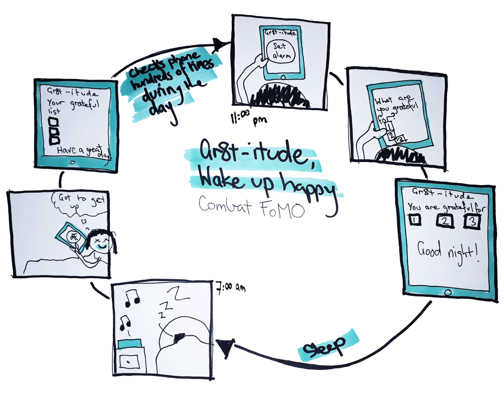
Once in bed, Maria uses Gr8ti-tude to set her alarm and then choose 3 things she is grateful for. The trigger of setting the alarm helps the act of gratitude easily become a habit. The Gr8ti-tude alarm reinforces Maria's happiness in the morning by waking her up and making her reflect on what she is grateful for.
By practicing gratitude, Maria will be thankful and happy with what she has achieved and experienced, making her immune to FoMO and increasing her general happiness.
Mood board
Colour
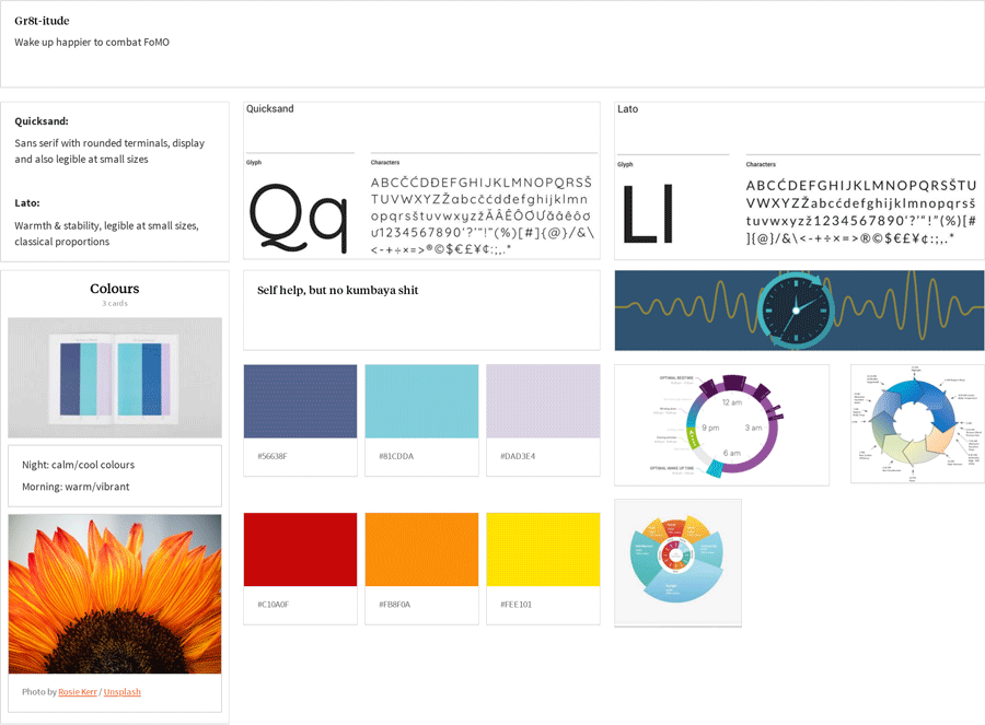
The app is used at two different times; at night – setting the alarm before sleep – and in the morning – waking up to the alarm. I chose a relaxing colour scheme for the night screens, to help prepare the user for sleep. The morning colour palette is vibrant and warm to help the user wake up.
Typefaces
For the logo, headings and button text I used the typeface Quicksand. It is sans-serif display typeface with rounded terminals that is also legible at small font sizes.
Lato is used for body text and sub-headings. I chose Lato for its warmth and stability, it is legible at small font sizes and it has classical proportions.
Feel
Self-help, but no kumbaya shit. Friendly, casual and fun.
Logo
I wanted the logo to reflect the alarm function of the app and for it to also incorporate a reference to the circadian rhythm. The roundness of the logo is for friendliness, according to Susan Weinschenk PhD, 'people prefer objects with curves – a preference that’s evident even in brain scans.' On the splash screen the arrows on the face of the clock can be animated to indicate loading, as seen in the InVision Studio clickable prototype.
MoSCoW
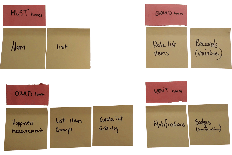
To help decide what features the app should and shouldn't have I used MoSCoW Analysis. This helped a lot to define what the minimum viable product was.
Lo-Fi Wireframes
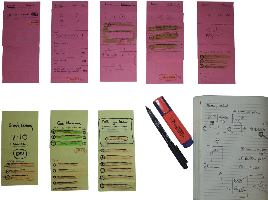
The next step involved sketching out the user flow and the basic UI of the app. To interate quickly through ideas I made wireframes from stacking stick-notes on-top of each other, this allowed me to quickly change components and test out different ideas.
User flow
The basic user flow is broken into two stages, night-time and morning.
At night the user sets their alarm and is prompted to set a maximum of 3 gratitudes for the day. The user can skip putting in gratitudes or even just put in 1 or 2, this is to promote 'reactance' – a sense of user autonomy required for repeat engagement.
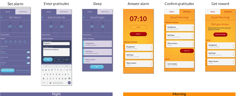
In the morning the user turns the alarm off and is presented with yesterday's gratitudes. Then the user presses a button to add the gratitudes to their 'Gr8t-ful List' and they receive a variable reward in the form of a piece of trivia.
Annotated details
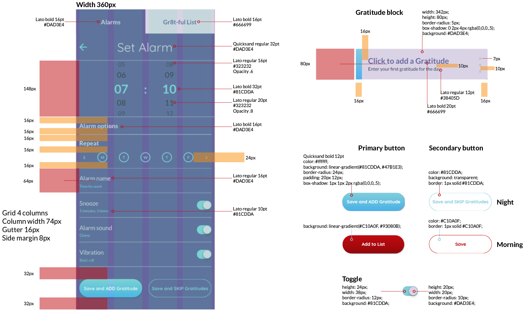
Annotated screen and buttons showing the specs for the wireframes, to make it easier when it is time to code, I have also included the CSS.
Summary
As stated above, Gr8ti-tude is a self-help alarm clock to help combat FoMO in an ever increasingly connected world. From the interviews conducted and the research I undertook, the solution isn't another app/service to get addicted to or even deleting your social media accounts. The key to this app is using the habit of an alarm (setting and waking up to it) as the trigger to establish a new behaviour.
Next steps would be to test this MVP on users to refine the UI and also to look into some other features such as happiness monitoring and image uploads to add to the gratitudes. The InVision Studio clickable prototype is available for you to see, unfortunately InVision lags a lot when viewing on mobile, I suggest you view this on a desktop to see what the actual experience would be like.
